R comes with built-in implementations of many probability distributions. This document will show how to generate these distributions in R by focusing on making plots, and so give the reader an intuitive feel for what all the different R functions are actually calculating.
Each probability distribution in R is associated with four functions that follow a naming convention: the probability density function always begins with ‘d’, the cumulative distribution function always begins with ‘p’, the inverse cumulative distribution (or quantile function) always begins with ‘q’, and a function that produces random variables always begins with ‘r’. Each function takes a single argument at which to evaluate the function followed by specific parameters that define the particular distribution function to evaluate.
In the following, we will demonstrate usage for the density, distribution, and quantile functions only. Each demonstration will include plots and simple examples.
Binomial Distribution
The binomial distribution is a probability distribution that describes the outcomes of a fixed number of independent trials with only two possible outcomes (success or failure) and a constant probability of success. It is characterized by two parameters:
\(n\) = the number of trials, and
\(p\) = the probability of success in each trial.
To calculate the probability of obtaining k successes in n trials, we use the probability mass function(PMF) given by the formula:
\[
P (X = k) = \binom{n}{k}p^k(1-p)^{n-k}
\]
where \(X\) represents the number of successes in \(n\) trials with probability of success \(p\). The symbol \(\displaystyle\binom{n}{k}\) represents the number of ways to choose k successes from n trials, and can be calculated using the formula \(\displaystyle\binom{n}{k} = \frac{n!}{k!(n-k)!}\). This presentation provides an overview of the binomial distribution.
Example: Scenario-Rolling a Die
Rolling a die 5 times and finding the probability of getting a 6 on each roll is an example of a binomial distribution. It satisfies the criteria of having:
A fixed number of trials \((5)\),
Two possible outcomes (success or failure),
A constant probability of success \((1/6)\),
And independent trials.
This scenario helps us understand the properties of binomial distributions, including mean, variance, and shape.
Properties of binomial distribution
Binomial distribution is a discrete probability distribution with two parameters: n (number of trials) and p (probability of success). Its properties include:
Discrete probability distribution: Binomial distribution is a discrete probability distribution since it assigns probabilities to a finite set of possible outcomes.
PMF: Probability mass function gives the probability of obtaining k successes in n trials.
CDF: Cumulative distribution function gives the probability of obtaining k or fewer successes in n trials.
Understanding these properties is important for using binomial distribution in various applications like quality control, hypothesis testing, and risk analysis.
Example: Binomial Distribution
Suppose we have a binomial distribution with n = 200 and p = 0.5. We can generate a random sample from this distribution using the rbinom() function in R.
Code
library(tidyverse)# Generate random sampleset.seed(123); n <-200; p <-0.5; x <-rbinom(n, size = n, prob = p)# Plot histogramggplot(data.frame(x), aes(x)) +geom_histogram(binwidth =1, color ="black", fill ="blue") +labs(x ="Number of successes", y ="Frequency") +ggtitle("Binomial Distribution") +theme(plot.title =element_text(hjust =0.5))
Probability Mass Function (pmf)
The PMF of a binomial distribution gives the probability of observing a specific number of successes (k) in n trials with probability of success p. It is defined as:
\[
P (X = k) = \binom{n}{k}p^k(1-p)^{n-k}
\]
The PMF maps each possible value to its probability, and is represented by a bar plot.
PMF is useful for modeling and analyzing discrete random variables, and can be used to calculate statistical measures such as mean, variance, and standard deviation.
PMF has the following properties: The probability of any value must be between 0 and 1. The sum of probabilities over all possible values must equal 1.
Bar Plot of pmf
Code
# Set the parametersn <-30;p <-0.5;x <-0:n# Calculate the probability mass functionpmf <-dbinom(x, n, p)pmf_df <-data.frame(x, pmf)#creates a ggplot object with pmf_df as the data source ggplot(pmf_df, aes(x = x, y = pmf)) +geom_bar(stat ="identity", fill ="dodgerblue") +ggtitle("PMF of Binomial Distribution") +xlab("Number of Successes") +ylab("Probability")+theme(plot.title =element_text(hjust =0.5))
Cumulative Distribution Function (cdf)
The Cumulative Distribution Function (CDF) is a function that shows the probability of a random variable taking on a value less than or equal to a certain number.Mathematically, the CDF is defined as:
\[
F(x)=P(X \le x)
\]
It ranges from 0 to 1 and provides a complete description of the distribution of the random variable.
It can be used to calculate statistical measures and make predictions. It can be represented graphically as a step function or a smooth curve.
Plot of cdf
Code
# Set the parametersn <-10;p <-0.5;x <-0:n# Cumulative Distribution Functioncdf <-pbinom(x, n, p)cdf_df <-data.frame(x, cdf)#creates a ggplot object with cdf_df as the data sourceggplot(cdf_df, aes(x = x, y = cdf)) +geom_line(color ="red") +ggtitle("CDF of Binomial Distribution") +xlab("Number of Successes") +ylab("Cumulative Probability")+theme(plot.title =element_text(hjust =0.5))
Mean and Variance
Given by the binomial probability mass function (PMF):
\[
P (X = k) = \binom{n}{k}p^k(1-p)^{n-k}
\]
where \(\displaystyle\binom{n}{k}\) is the binomial coefficient, which gives the number of ways to choose k successes from n trials. - The expected value and variance of a binomial distribution are:
\[
E(X) = np
\]
and
\[
Var(X) = np(1-p)
\]
The mean tells us the average value of the data, while the variance tells us how spread out the data is. - These two measures are important for understanding the shape and behavior of probability distributions, including the binomial distribution.
Normal Approximation
The binomial distribution can be approximated by a normal distribution with the same mean and variance when n is large and p is not too close to 0 or 1. This is known as the normal approximation to the binomial distribution.
The mean and variance of the normal distribution are:
\[
\mu = np
\]
and \[\sigma^2 = np(1-p)\]
The normal approximation can be useful when calculating probabilities for large n and p that are not too extreme. Suppose n = 100 and p = 0.3 then \(\mu =np =30 ,\sigma^2 = np(1-p) = 21\)
\[
Z = \frac{X-\mu}{\sigma} \sim N(0,1)
\]
where X is the number of successes in n trials, and Z is the standardized normal variable.
Note
R function dbinom(x, size, prob) is the probability of x successes in size trials when the probability of success is prob. R function pbinom(q, size, prob, lower.tail) is the cumulative probability (lower.tail = TRUE for left tail, lower.tail = FALSE for right tail) of less than or equal to q successes. R function rbinom(n, size, prob) returns n random numbers from the binomial distribution x~b(size,prob).
Example
Q. What is the probability of 2 heads in 10 coin flips where probability of heads is 0.3?
Random varaible \(X\) is distributed \(X∼P(λ)\) with mean \(\mu= \lambda\) and variance \(\sigma^2=\lambda\) if \(X=x\) is the number of successes in \(n\) (many) trials when the probability of success \(\lambda/n\) is small. The probability of \(X=k\) successes is \(\displaystyle P(X=k) = \frac{e^{-\lambda}\lambda^k}{k!}\).
R function dpois(x, lambda) is the probability of x successes in a period when the expected number of events is lambda. R function ppois(q, lambda, lower.tail) is the cumulative probability (lower.tail = TRUE for left tail, lower.tail = FALSE for right tail) of less than or equal to q successes. R function rpois(n, lambda) returns n random numbers from the Poisson distribution x ~ P(lambda). R function qpois(p, lambda, lower.tail returns the value (quantile) at the specified cumulative probability (percentile) p.
Example
What is the probability of making 2 to 4 sales in a week if the average sales rate is 3 per week?
Code
# Using cumulative probabilityppois(q =4, lambda =3, lower.tail =TRUE) -ppois(q =1, lambda =3, lower.tail =TRUE)# Using exact probabilitydpois(x =2, lambda =3) +dpois(x =3, lambda =3) +dpois(x =4, lambda =4)# expected number of sales = lambda = 3# variance = lambda = 3library(tidyverse)library(dplyr)options(scipen =999, digits =2) # sig digitsevents <-0:10density <-dpois(x = events, lambda =3)prob <-ppois(q = events, lambda =3, lower.tail =TRUE)df <-data.frame(events, density, prob)ggplot(df, aes(x =factor(events), y = density)) +geom_col() +geom_text(aes(label =round(density,2), y = density +0.01),position =position_dodge(0.9),size =3,vjust =0 ) +labs(title ="PMF and CDF of Poisson Distribution",subtitle ="P(3).",x ="Events (x)",y ="Density") +geom_line(data = df, aes(x = events, y = prob))
Example
Suppose a baseball player has a p=.300 batting average. What is the probability of\(X \le 150\)hits in\(n=500\)at bats?\(X=150\)?\(X>150\)?
Code
# probability of x <= 150ppois(q =150, lambda = .300*500, lower.tail =TRUE)# probability of x = 150dpois(x =150, lambda = .300*500)# probability of x > 150ppois(q =150, lambda = .300*500, lower.tail =FALSE) options(scipen =999, digits =2) # sig digitshits <-0:100*3density <-dpois(x = hits, lambda = .300*500)prob <-ppois(q = hits, lambda = .300*500, lower.tail =TRUE)df <-data.frame(hits, density, prob)ggplot(df, aes(x = hits, y = density)) +geom_col() +labs(title ="Poisson(150)",subtitle ="PMF and CDF of Poisson(3) distribution.",x ="Hits (x)",y ="Density") +geom_line(data = df, aes(x = hits, y = prob))
The Poisson distribution approximates the binomial distribution with \(\lambda=np\) if \(n \ge 20\) and \(p \le 0.05\).
Example
What is the distribution of successes from a sample of n = 50 when the probability of success is p = .03?
Code
options(scipen =999, digits =2) # sig digitsn =0:10df <-data.frame(events =0:10, Poisson =dpois(x = n, lambda = .03*50),Binomial =dbinom(x = n, size =50, p = .03))df_tidy <-gather(df, key ="Distribution", value ="density", -c(events))ggplot(df_tidy, aes(x =factor(events), y = density, fill = Distribution)) +geom_col(position ="dodge") +labs(title ="Poisson(15) and Binomial(50, .03)",subtitle ="Poisson approximates binomial when n >= 20 and p <= .05.",x ="Events (x)",y ="Density")
Example
Suppose the probability that a drug produces a certain side effect is p = 0.1% and\(n = 1,000\)patients in a clinical trial receive the drug. What is the probability\(0\)people experience the side effect?
Code
# The expected value is np1000* .001# The probability of measuring 0 when the expected value is 1dpois(x =0, lambda =1000* .001)options(scipen =999, digits =2) # sig digitsx <-0:10density <-dpois(x = x, lambda =1000* .001)prob <-ppois(q = x, lambda =1000* .001, lower.tail =TRUE)df <-data.frame(x, density, prob)ggplot(df, aes(x = x, y = density)) +geom_col() +geom_text(aes(label =round(density,2), y = density +0.01),position =position_dodge(0.9),size =3,vjust =0 ) +labs(title ="Poisson(1)",subtitle ="PMF and CDF of Poisson(1) distribution.",x ="Events (x)",y ="Density") +geom_line(data = df, aes(x = x, y = prob))
Normal Distribution
Distribution Functions in R
dnorm: Probability Density Function (PDF) of the normal distribution pnorm: Cumulative Density Function (CDF) of the normal distribution qnorm: Quantile function of the normal distribution rnorm: Random sampling from the normal distribution
The probability density function (PDF, in short: density) indicates the probability of observing a measurement with a specific value and thus the integral over the density is always 1. For a value \(x\) , the normal density is defined as
where \(\mu\) is the mean, \(\sigma\) is the standard deviation, and \(\sigma^2\) is the variance.
Using the density, it is possible to determine the probabilities of each event.
For example, you may wonder: What is the likelihood that a person has an IQ of exactly 140?. In this case, you would need to retrieve the density of the IQ distribution at value 140. The IQ distribution can be modeled with a mean of 100 and a standard deviation of 15. The corresponding density is:
Code
#Datasample.range <-50:150iq.mean <-100iq.sd <-15iq.dist <-dnorm(sample.range, mean = iq.mean, sd = iq.sd)iq.df <-data.frame("IQ"= sample.range, "Density"= iq.dist)ggplot(iq.df, aes(x = IQ, y = Density)) +geom_point() +ylab("Density (Probability)")#Function to print percentagepp <-function(x) {print(paste0(round(x *100, 3), "%"))}#Likelihood IQ >= 140?pp(sum(iq.df$Density[iq.df$IQ >=140]))#Likelihood of 75 <= IQ <= 90?pp(sum(iq.df$Density[iq.df$IQ >=75& iq.df$IQ <=90]))
Cumulative Density Function (pnorm)
The cumulative density (CDF) function is a monotonically increasing function as it integrates over densities via
#CDF Lower Tail (P[X <= x])cdf_lower <-pnorm(sample.range, mean = iq.mean, sd = iq.sd, lower.tail =TRUE)iq.df <-cbind(iq.df, "CDF_LowerTail"= cdf_lower)ggplot(iq.df, aes(x = IQ, y = CDF_LowerTail)) +geom_point()#Likelihood of 50 < IQ <= 90?pp(iq.df$CDF_LowerTail[iq.df$IQ ==90])#CDF Upper Tail (P[X > x])cdf_upper <-pnorm(sample.range, mean = iq.mean, sd = iq.sd, lower.tail =FALSE)iq.df <-cbind(iq.df, "CDF_UpperTail"= cdf_upper)ggplot(iq.df, aes(x = IQ, y = CDF_UpperTail)) +geom_point()#Likelihood of IQ > 125pp(iq.df$CDF_UpperTail[iq.df$IQ ==125])
From the chart above, we can see the cumulative probability distribution of \(P(X \le x)\).
The Quantile Function (qnorm)
The quantile function is simply the inverse of the cumulative density function (iCDF). Thus, the quantile function maps from probabilities to values. Let’s take a look at the quantile function for \(P(X \le x)\).
Code
#List of probabilities from 0 to 100%, by 0.1%prob.range <-seq(from =0, to =1, by =0.001)#Minimum IQ required to reach certain percentileiCDF_lower <-qnorm(prob.range, mean = iq.mean, sd = iq.sd, lower.tail =TRUE)iCDF.df <-data.frame("Percentile"= prob.range, "Min_IQ"= iCDF_lower)ggplot(iCDF.df, aes(x = Percentile, y = Min_IQ)) +geom_point()
Code
#What is the 25th IQ percentile?iCDF.df$Min_IQ[iCDF.df$Percentile ==0.25]#What is the minimum IQ for reaching the TOP-10 or 90th percentile?#Option 1 (Using iCDF table)iCDF.df$Min_IQ[iCDF.df$Percentile ==0.75]#Option 2 (using qnorm)qnorm(0.9, mean = iq.mean, sd = iq.sd)#Or we can see minimum IQ to reach 25th, 50th, 75th, 100th percentile at oncequantile(iCDF.df$Min_IQ)#To see various custom quantiles (eg. 50th to 100th, separated by 10th)quantile(iCDF.df$Min_IQ, probs =seq(from =0.5, to =1, by =0.1))
Probability Density Function (rnorm)
When you want to draw random samples from the normal distribution, you can use rnorm. For example, we could use rnorm to simulate random samples from the IQ distribution.
Code
#To fix random seed for reproducibilityset.seed(1)#Law of large numbers: the more samples, #the more mean reaches the expected valuesamples <-c(100, 1000, 10000)#Combine list of sample IQs (rbind) for each samples (sapply)sample.df <-do.call(rbind, lapply(samples, function(x) {#To create a random IQ for each sample size groupdata.frame("SampleSize"= x,"IQ"=rnorm(x, mean = iq.mean, sd = iq.sd))}))#Plot the results (histograms) for each SampleSize groupggplot(data = sample.df, aes(x = IQ)) +#Create histogramgeom_histogram() +#To separate histogram based on different groups (ie. SampleSize)facet_wrap(facets = sample.df$SampleSize, #The groupsscales ="free_y") #To fix x-axis scale, #but to allow y-axis to scale dynamically
Code
#We can also create a sample #(with replacement, aka. independent variables when #taking one sample doesn't #affect the probability of others) from the Probability Density Tablesample_pdf <-sample(iq.df$IQ, size =100, prob = iq.df$Density, replace =TRUE)sample_pdf.df <-data.frame("IQ"= sample_pdf)ggplot(sample_pdf.df, aes(x = IQ)) +geom_histogram()
Simulation of Exponential Distribution
Exponential distribution describes times between events happening at constant rate lambda with expected value \(\frac{1}{\lambda}\)
Definition
\[
f_X(x) = \lambda e^{-\lambda x} , x>0
\]
Here is a graph of the exponential distribution with mean = 1.
Sample exponential distribution
Code
set.seed(2021) # for reproducabilitynosim <-1000# no of simulationsn <-40# no of exponentialslambda <-0.2# rate parameter simdata <-matrix(rexp(nosim * n, rate=lambda), nosim)sim_mean <-rowMeans(simdata) # row means# calculate mean, sd and variance of sample exp distsimdata_mean <-mean(sim_mean)simdata_sd <-sd(sim_mean)simdata_var <-var(sim_mean)
With the no of simulations, no of exponentials, and the rate parameter, we can simulate the exponential distribution by multiplying the exponential by the no of simulations, giving us 1000 simulations of 40 exponentials. We put it in matrix form, and use the apply function to find the mean for each row.
With this, we can then find the sample mean, standard deviation and variance.
Theoretical exponential distribution
Code
# calculate mean, df and variance of theoretical exp distt_mean =1/lambdat_sd = (1/lambda) * (1/sqrt(n))t_var = t_sd^2
Histogram of sample exponential distribution vs Averages of simulated exponentials.
Code
par(mfrow =c(1, 2))hist(simdata,col ="steelblue",main ="Simulated exponential distribution",xlab ="40 random exponentials")hist(sim_mean,col ="red3",main ="Averages of Simulated Exponentials",xlab ="Average of 40 exponentials")abline(v = t_mean, col ="green", lwd =2) # theoretical mean
Comment
The blue histogram represents the simulated exponential distribution, as you can see most of the data is at the left side of the plot because of the properties of the exponential distribution.
Observing the histogram for the averages of simulated exponentials, we can see it’s following the form of a normal distribution. This will be further investigated later on in the report.
The green line represents the theoretical mean of the distribution, and our simulated distribution is centered closely at the line.
Comparison between sample and theoretical statistics
Observing the table, the sample mean of the exponential distribution is centered at 5.008 whereas the theoretical mean, 1/lambda is 5
The difference between the sample and theoretical mean is 0.0086
Sample Variance versus Theoretical Variance
The sample Variance is is 0.621, which is very close to the theoretical variance, 0.625.
The difference between them is 0.0037
Distribution
Histogram and Density plot
Code
library(ggplot2)simdata_mean <-data.frame(sim_mean)ggplot(simdata_mean, aes(sim_mean)) +geom_histogram(binwidth = .3,fill ="steelblue",color ="black",aes(y = ..density..) ) +geom_density(color ="blue", lwd =1) +labs(title ="Distribution of Random Exponential Values with 1000 simulations",x ="Average of 40 Exponentials", y ="Density") +stat_function(fun = dnorm,args =list(mean = t_mean, sd = t_sd),color ="red",lwd =1 ) +theme_bw()
Comment: The red line is the theoretical normal distribution density, whereas the blue line is the density of the sample distribution. You can see that the sample distribution is approximately normal.
Observing the normal Q-Q plot, we can conclude that the sample distribution approximates the theoretical normal distribution quite closely, with the tails being less normal.
Conclusion
Based on the comparisons and the plots, the simulated sample distribution (as n grows larger) does indeed have similar means and variance with the theoretical distribution. This proves the Central Limit Theorem is in fact true.
An important condition for the central limit theorem is that the random variables are IID, which stands for Independent and Identically Distributed. These conditions are satisfied as we simulated the data using R.
Here we will investigate the exponential distribution in R and compare it with the Central Limit Theorem. The exponential distribution can be simulated in R with rexp(n, lambda) where lambda is the rate parameter. The mean of exponential distribution is \(1/\lambda\) and the standard deviation is also \(1/\lambda\).
To achieve this we will investigate the distribution of averages of 40 exponentials with lambda 0.2, replicated a thousand times.
Code
set.seed(1)library(tidyverse)theme_set(theme_bw())lambda <-0.2n <-40data <-data.frame(value =c(t(rexp(1000, rate =1)))) ggplot(data, aes(x=value)) +geom_histogram(aes(y=..density..),binwidth=.25, col="black", fill="lightblue")+labs(title="Exponential distribution with mean = 1", caption="Abhirup Moitra") +xlab("x") +ylab("y")
The central limit theorem states that if you have a population with mean \(\mu\) and standard deviation \(\sigma\) and take sufficiently large random samples from the population, then the distribution of the sample means will be approximately normally distributed.
This will hold true regardless of whether the source population is normal or skewed, provided the sample size is sufficiently large (usually \(n > 30\)). If the population is normal, then the theorem holds true even for samples smaller than 30. In fact, this also holds true even if the population is binomial, provided that min(np, n(1-p))> 5, where n is the sample size and p is the probability of success in the population. This means that we can use the normal probability model to quantify uncertainty when making inferences about a population mean based on the sample mean.
Simulation
First we are going to simulate our exponential distribution, and replicated it one thousand times.
Code
expData <-replicate(1000, rexp(n, lambda)) # replicate 1000 times expData <-data.frame(value =c(t(expData))) # convert to data frame# plotggplot(expData, aes(x=value)) +geom_histogram(aes(y=..density..), binwidth=.8,colour="black", fill="lightblue") +labs(title="Exponential distribution with lambda = 0.2 and 40 observations", subtitle ="Replicated 1000 times", caption="Abhirup Moitra") +xlab("x") +ylab("exp(x)")
According to the Central Limit Theorem, if we take simple random samples from the population and compute the mean for each of the samples, the distribution of sample means should be approximately normal.
Thus, we can calculate the mean of the distribution one thousand times and save its value in a data frame and the resulted distribution should be approximately normal.
Code
data <-replicate(1000, mean(rexp(n,lambda)))data <-data.frame(value =c(t(data)), size =40)ggplot(data, aes(x=value)) +geom_histogram(aes(y=..density..),binwidth=.25, col="black", fill="lightblue") +labs(title="Average of 40 random exponential distribution", subtitle ="Replicated 1000 times", caption="Abhirup Moitra") +xlab("x") +ylab("mean")
Sample Mean versus Theoretical Mean
We know that the theoretical mean is given by 1/lambda, so we can calculate it and compare it with the sample mean.
Distribution: the distribution is approximately normal
In order to show graphically that this distribution is normally distributed, we can normalize it by its mean and standard deviation. This transforms it into a Standard Normal Distribution, N(0,1). So let’s do that normalization, plot the histogram of the transformed distribution, and show how it compares to an exact Standard Normal Distribution, by overlaying it:
Code
ggplot(data, aes(x=value)) +geom_histogram(aes(y=..density..),binwidth=.25, col="black", fill="lightblue") +stat_function(fun=dnorm,color="blue",args=list(mean=mean(data$value), sd=sd(data$value)))+labs(title="Average of 40 random exponential distribution", subtitle ="Replicated 1000 times", caption="Abhirup Moitra") +xlab("x") +ylab("y")
Source Code
---title: "Elementary Probability Distribution"author: "Abhirup Moitra"date: 2023-11-26format: html: code-fold: true code-tools: trueeditor: visualcategories : [Mathematics, R Programming, Probability Theory]image: probability-distributions.png---# **Basic Probability Distributions in R**R comes with built-in implementations of many probability distributions. This document will show how to generate these distributions in R by focusing on making plots, and so give the reader an intuitive feel for what all the different R functions are actually calculating.Each probability distribution in R is associated with four functions that follow a naming convention: the probability density function always begins with 'd', the cumulative distribution function always begins with 'p', the inverse cumulative distribution (or quantile function) always begins with 'q', and a function that produces random variables always begins with 'r'. Each function takes a single argument at which to evaluate the function followed by specific parameters that define the particular distribution function to evaluate.In the following, we will demonstrate usage for the density, distribution, and quantile functions only. Each demonstration will include plots and simple examples.{fig-align="center"}# Binomial DistributionThe binomial distribution is a probability distribution that describes the outcomes of a fixed number of independent trials with only two possible outcomes (success or failure) and a constant probability of success. It is characterized by two parameters:- $n$ = the number of trials, and- $p$ = the probability of success in each trial.To calculate the probability of obtaining k successes in n trials, we use the probability mass function(PMF) given by the formula:$$P (X = k) = \binom{n}{k}p^k(1-p)^{n-k}$$where $X$ represents the number of successes in $n$ trials with probability of success $p$. The symbol $\displaystyle\binom{n}{k}$ represents the number of ways to choose k successes from n trials, and can be calculated using the formula $\displaystyle\binom{n}{k} = \frac{n!}{k!(n-k)!}$. This presentation provides an overview of the binomial distribution.## **Example: Scenario-Rolling a Die**Rolling a die 5 times and finding the probability of getting a 6 on each roll is an example of a binomial distribution. It satisfies the criteria of having:- A fixed number of trials $(5)$,- Two possible outcomes (success or failure),- A constant probability of success $(1/6)$,- And independent trials.This scenario helps us understand the properties of binomial distributions, including mean, variance, and shape.## **Properties of binomial distribution**Binomial distribution is a discrete probability distribution with two parameters: n (number of trials) and p (probability of success). Its properties include:- **Discrete probability distribution:** Binomial distribution is a discrete probability distribution since it assigns probabilities to a finite set of possible outcomes.- **PMF:** Probability mass function gives the probability of obtaining k successes in n trials.- **CDF**: Cumulative distribution function gives the probability of obtaining k or fewer successes in n trials.Understanding these properties is important for using binomial distribution in various applications like quality control, hypothesis testing, and risk analysis.## **Example: Binomial Distribution**Suppose we have a binomial distribution with `n` = 200 and `p` = 0.5. We can generate a random sample from this distribution using the `rbinom()` function in R.```{r,message=FALSE,warning=FALSE,eval=FALSE}library(tidyverse)# Generate random sampleset.seed(123); n <- 200; p <- 0.5; x <- rbinom(n, size = n, prob = p)# Plot histogramggplot(data.frame(x), aes(x)) + geom_histogram(binwidth = 1, color = "black", fill = "blue") + labs(x = "Number of successes", y = "Frequency") + ggtitle("Binomial Distribution") + theme(plot.title = element_text(hjust = 0.5))```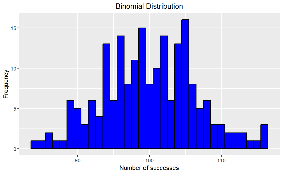{fig-align="center"}## **Probability Mass Function (pmf)**- The PMF of a binomial distribution gives the probability of observing a specific number of successes (k) in n trials with probability of success p. It is defined as: $$ P (X = k) = \binom{n}{k}p^k(1-p)^{n-k} $$- The PMF maps each possible value to its probability, and is represented by a bar plot.- PMF is useful for modeling and analyzing discrete random variables, and can be used to calculate statistical measures such as mean, variance, and standard deviation.- PMF has the following properties: ***The probability of any value must be between 0 and 1. The sum of probabilities over all possible values must equal 1.***## **Bar Plot of pmf**```{r,eval=FALSE}# Set the parametersn <- 30;p <- 0.5;x <- 0:n# Calculate the probability mass functionpmf <- dbinom(x, n, p)pmf_df <- data.frame(x, pmf)#creates a ggplot object with pmf_df as the data source ggplot(pmf_df, aes(x = x, y = pmf)) + geom_bar(stat = "identity", fill = "dodgerblue") + ggtitle("PMF of Binomial Distribution") + xlab("Number of Successes") + ylab("Probability")+ theme(plot.title = element_text(hjust = 0.5))```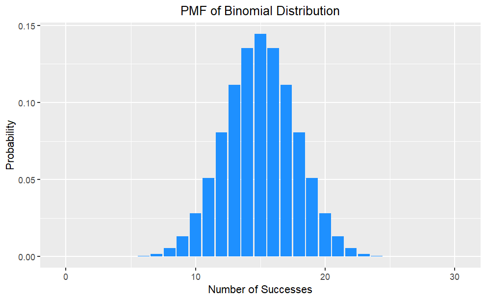{fig-align="center"}## **Cumulative Distribution Function (cdf)**- The Cumulative Distribution Function (CDF) is a function that shows the probability of a random variable taking on a value less than or equal to a certain number.Mathematically, the CDF is defined as: $$ F(x)=P(X \le x) $$- It ranges from 0 to 1 and provides a complete description of the distribution of the random variable.- It can be used to calculate statistical measures and make predictions. It can be represented graphically as a step function or a smooth curve.## **Plot of cdf**```{r,eval=FALSE}# Set the parametersn <- 10;p <- 0.5;x <- 0:n# Cumulative Distribution Functioncdf <- pbinom(x, n, p)cdf_df <- data.frame(x, cdf)#creates a ggplot object with cdf_df as the data sourceggplot(cdf_df, aes(x = x, y = cdf)) + geom_line(color = "red") + ggtitle("CDF of Binomial Distribution") + xlab("Number of Successes") + ylab("Cumulative Probability")+ theme(plot.title = element_text(hjust = 0.5))```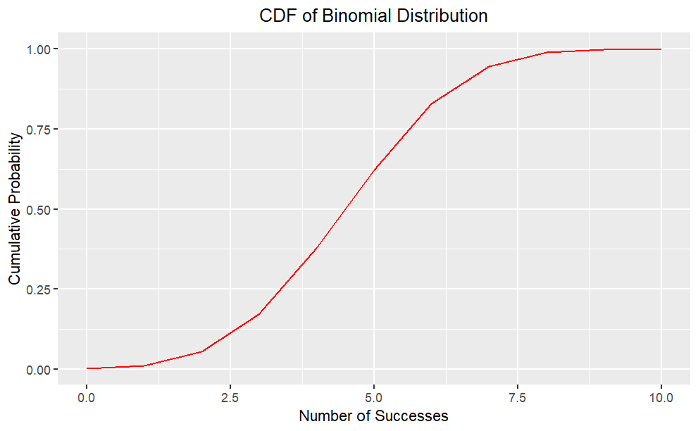{fig-align="center"}## **Mean and Variance**Given by the **binomial probability mass function (PMF)**:$$P (X = k) = \binom{n}{k}p^k(1-p)^{n-k}$$where $\displaystyle\binom{n}{k}$ is the binomial coefficient, which gives the number of ways to choose `k` successes from `n` trials. - The expected value and variance of a binomial distribution are:$$E(X) = np$$and$$Var(X) = np(1-p)$$The mean tells us the average value of the data, while the variance tells us how spread out the data is. - These two measures are important for understanding the shape and behavior of probability distributions, including the binomial distribution.## **Normal Approximation**The binomial distribution can be approximated by a normal distribution with the same mean and variance when `n` is large and `p` is not too close to 0 or 1. This is known as the **normal approximation to the binomial distribution**.- The mean and variance of the normal distribution are: $$ \mu = np $$and $$\sigma^2 = np(1-p)$$The normal approximation can be useful when calculating probabilities for large `n` and `p` that are not too extreme. Suppose `n` = 100 and `p` = 0.3 then $\mu =np =30 ,\sigma^2 = np(1-p) = 21$$$Z = \frac{X-\mu}{\sigma} \sim N(0,1)$$where `X` is the number of successes in `n` trials, and `Z` is the standardized normal variable.### **Note**R function `dbinom(x, size, prob)` is the probability of `x` successes in `size` trials when the probability of success is `prob`. R function `pbinom(q, size, prob, lower.tail)` is the cumulative probability (`lower.tail = TRUE` for left tail, `lower.tail = FALSE` for right tail) of less than or equal to `q` successes. R function rbinom(n, size, prob) returns `n` random numbers from the binomial distribution `x~b(size,prob)`.## **Example**Q. What is the probability of 2 heads in 10 coin flips where probability of heads is 0.3?```{r,message=FALSE,warning=FALSE,eval=FALSE}# exactdbinom(x = 2, size = 10, prob = 0.3)# simulatedmean(rbinom(n = 10000, size = 10, prob = 0.3) == 2)library(dplyr)library(ggplot2)#library(scales)data.frame(heads = 0:10, prob = dbinom(x = 0:10, size = 10, prob = 0.3)) %>% mutate(Heads = ifelse(heads == 2, "2", "other")) %>%ggplot(aes(x = factor(heads), y = prob, fill = Heads)) + geom_col() + geom_text( aes(label = round(prob,2), y = prob + 0.01), position = position_dodge(0.9), size = 3, vjust = 0 ) + labs(title = "Probability of X = 2 successes.", subtitle = "b(10, .3)", x = "Successes (x)", y = "probability") ```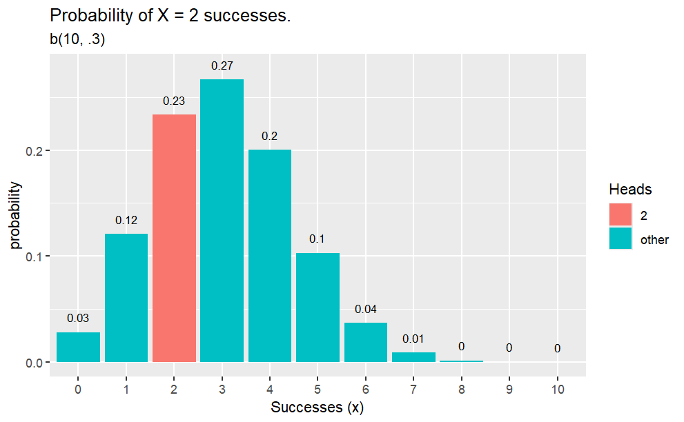{fig-align="center"}### **Example***What is the probability of* $\le 5$ *heads in* $10$ *coin flips where probability of heads is* $0.3$*?*```{r,eval=FALSE}# exactpbinom(q = 5, size = 10, p = 0.3, lower.tail = TRUE)# simulatedmean(rbinom(n = 10000, size = 10, prob = 0.3) <= 5)data.frame(heads = 0:10, pmf = dbinom(x = 0:10, size = 10, prob = 0.3), cdf = pbinom(q = 0:10, size = 10, prob = 0.3, lower.tail = TRUE)) %>% mutate(Heads = ifelse(heads <= 5, "<=5", "other")) %>%ggplot(aes(x = factor(heads), y = cdf, fill = Heads)) + geom_col() + geom_text( aes(label = round(cdf,2), y = cdf + 0.01), position = position_dodge(0.9), size = 3, vjust = 0 ) + labs(title = "Probability of X <= 5 successes.", subtitle = "b(10, .3)", x = "Successes (x)", y = "probability") ```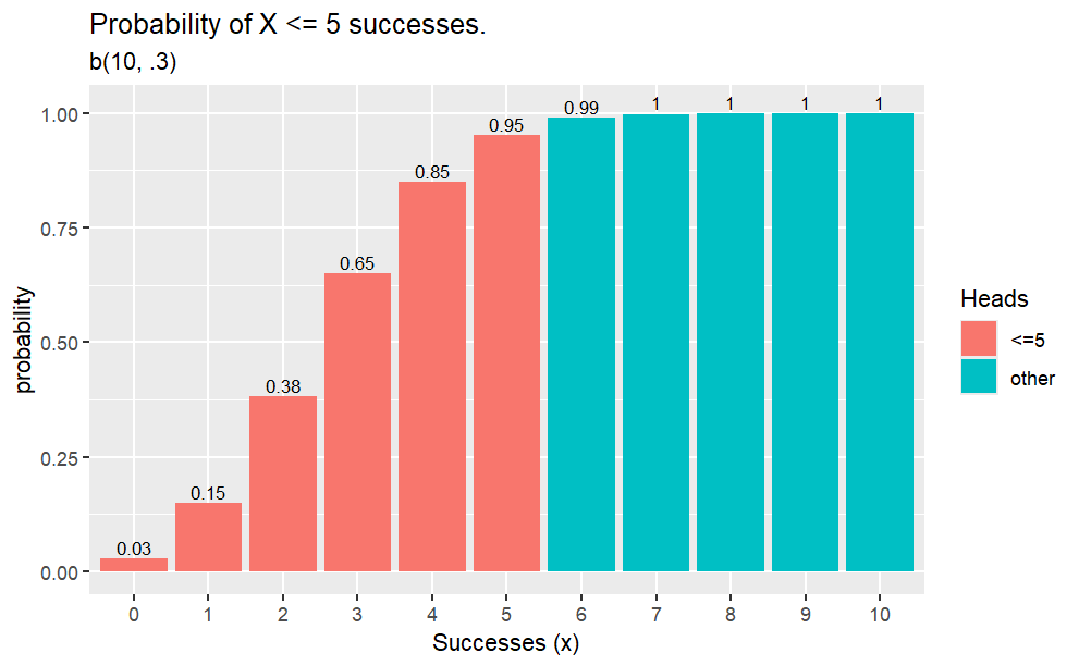{fig-align="center"}### **Example***What is the probability of* $>=5$ *heads in* $10$ *coin flips where probability of heads is* $0.3$*?*```{r,eval=FALSE}# exactpbinom(q = 4, size = 10, p = 0.3, lower.tail = FALSE)# simulatedmean(rbinom(n = 10000, size = 10, prob = 0.3) >= 5)data.frame(heads = 0:10, pmf = dbinom(x = 0:10, size = 10, prob = 0.3), cdf = pbinom(q = -1:9, size = 10, prob = 0.3, lower.tail = FALSE)) %>% mutate(Heads = ifelse(heads >= 5, ">=5", "other")) %>%ggplot(aes(x = factor(heads), y = cdf, fill = Heads)) + geom_col() + geom_text( aes(label = round(cdf,2), y = cdf + 0.01), position = position_dodge(0.9), size = 3, vjust = 0 ) + labs(title = "Probability of X >= 5 successes.", subtitle = "b(10, .3)", x = "Successes (x)", y = "probability") ```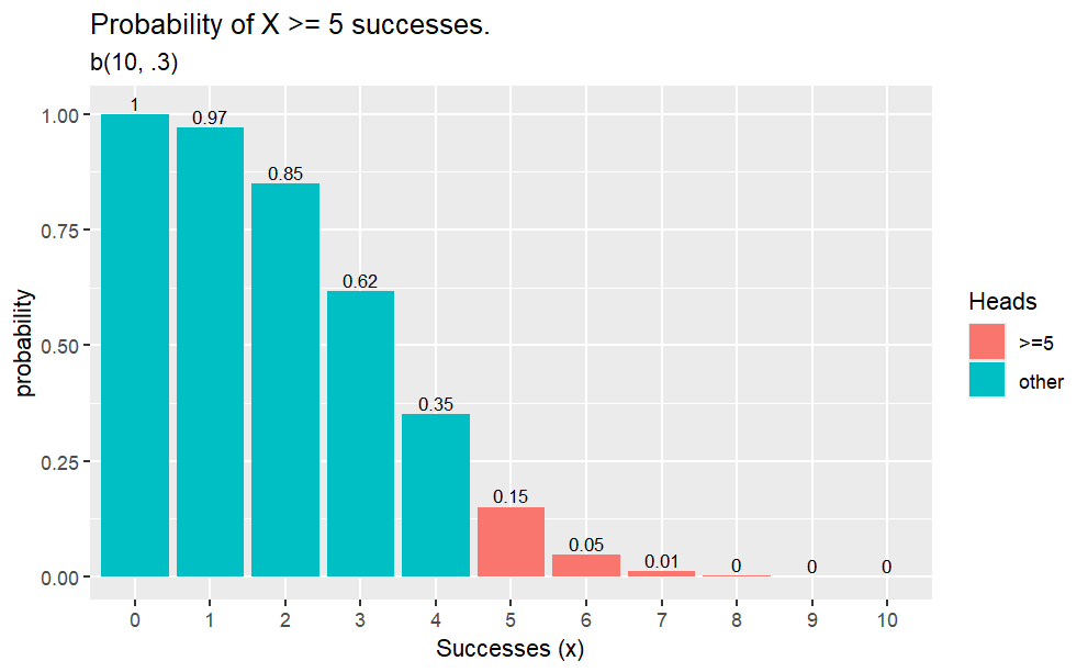{fig-align="center"}### **Example***What is the expected number of heads in 25 coin flips where probability of heads is 0.3?*```{r,eval=FALSE}# exact25 * 0.3mean(rbinom(n = 10000, size = 25, prob = .3))# Variance25 * 0.3 * (1 - 0.3)var(rbinom(n = 10000, size = 25, prob = .3))data.frame(heads = 0:25, pmf = dbinom(x = 0:25, size = 25, prob = 0.3)) %>%ggplot(aes(x = factor(heads), y = pmf)) + geom_col() + geom_text( aes(label = round(pmf,2), y = pmf + 0.01), position = position_dodge(0.9), size = 3, vjust = 0 ) + labs(title = "Probability of X = x successes.", subtitle = "b(25, .3)", x = "Successes (x)", y = "probability") ```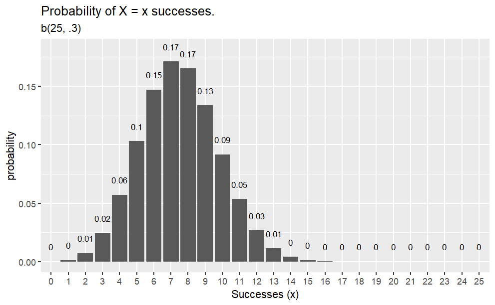{fig-align="center"}# **Poisson Distribution**## **Functions `dpois`, `ppois`, and `rpois`**Random varaible $X$ is distributed $X∼P(λ)$ with mean $\mu= \lambda$ and variance $\sigma^2=\lambda$ if $X=x$ is the number of successes in $n$ (many) trials when the probability of success $\lambda/n$ is small. The probability of $X=k$ successes is $\displaystyle P(X=k) = \frac{e^{-\lambda}\lambda^k}{k!}$.R function `dpois(x, lambda)` is the probability of `x` successes in a period when the expected number of events is `lambda`. R function `ppois(q, lambda, lower.tail)` is the cumulative probability (`lower.tail = TRUE` for left tail, `lower.tail = FALSE` for right tail) of less than or equal to `q` successes. R function `rpois(n, lambda)` returns `n` random numbers from the Poisson distribution `x ~ P(lambda)`. R function `qpois(p, lambda, lower.tail` returns the value (quantile) at the specified cumulative probability (percentile) `p`.#### **Example***What is the probability of making 2 to 4 sales in a week if the average sales rate is 3 per week?*```{r,eval=FALSE}# Using cumulative probabilityppois(q = 4, lambda = 3, lower.tail = TRUE) - ppois(q = 1, lambda = 3, lower.tail = TRUE)# Using exact probabilitydpois(x = 2, lambda = 3) + dpois(x = 3, lambda = 3) + dpois(x = 4, lambda = 4)# expected number of sales = lambda = 3# variance = lambda = 3library(tidyverse)library(dplyr)options(scipen = 999, digits = 2) # sig digitsevents <- 0:10density <- dpois(x = events, lambda = 3)prob <- ppois(q = events, lambda = 3, lower.tail = TRUE)df <- data.frame(events, density, prob)ggplot(df, aes(x = factor(events), y = density)) + geom_col() + geom_text( aes(label = round(density,2), y = density + 0.01), position = position_dodge(0.9), size = 3, vjust = 0 ) + labs(title = "PMF and CDF of Poisson Distribution", subtitle = "P(3).", x = "Events (x)", y = "Density") + geom_line(data = df, aes(x = events, y = prob))```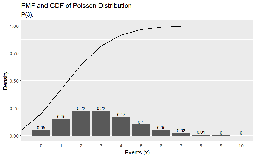{fig-align="center"}#### **Example***Suppose a baseball player has a p=.300 batting average. What is the probability of* $X \le 150$ *hits in* $n=500$ *at bats?* $X=150$*?* $X>150$*?*```{r,eval=FALSE}# probability of x <= 150ppois(q = 150, lambda = .300 * 500, lower.tail = TRUE)# probability of x = 150dpois(x = 150, lambda = .300 * 500)# probability of x > 150ppois(q = 150, lambda = .300 * 500, lower.tail = FALSE) options(scipen = 999, digits = 2) # sig digitshits <- 0:100 * 3density <- dpois(x = hits, lambda = .300 * 500)prob <- ppois(q = hits, lambda = .300 * 500, lower.tail = TRUE)df <- data.frame(hits, density, prob)ggplot(df, aes(x = hits, y = density)) + geom_col() + labs(title = "Poisson(150)", subtitle = "PMF and CDF of Poisson(3) distribution.", x = "Hits (x)", y = "Density") + geom_line(data = df, aes(x = hits, y = prob))```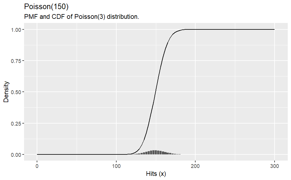{fig-align="center"}The Poisson distribution approximates the binomial distribution with $\lambda=np$ if $n \ge 20$ and $p \le 0.05$.#### **Example***What is the distribution of successes from a sample of n = 50 when the probability of success is p = .03?*```{r,eval=FALSE}options(scipen = 999, digits = 2) # sig digitsn = 0:10df <- data.frame(events = 0:10, Poisson = dpois(x = n, lambda = .03 * 50), Binomial = dbinom(x = n, size = 50, p = .03))df_tidy <- gather(df, key = "Distribution", value = "density", -c(events))ggplot(df_tidy, aes(x = factor(events), y = density, fill = Distribution)) + geom_col(position = "dodge") + labs(title = "Poisson(15) and Binomial(50, .03)", subtitle = "Poisson approximates binomial when n >= 20 and p <= .05.", x = "Events (x)", y = "Density")```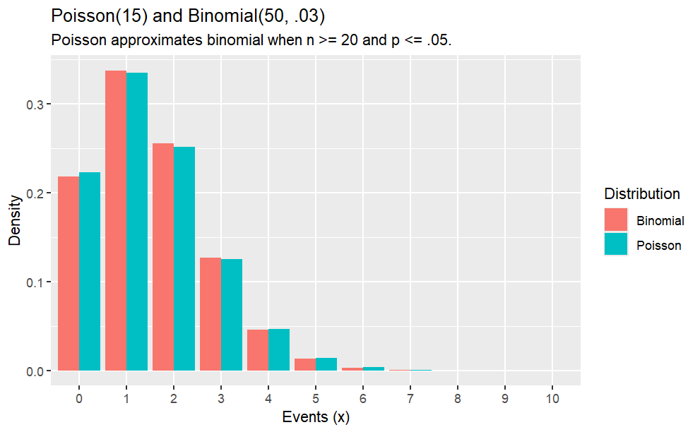{fig-align="center"}#### **Example***Suppose the probability that a drug produces a certain side effect is* p = 0.1% *and* $n = 1,000$ *patients in a clinical trial receive the drug. What is the probability* $0$ *people experience the side effect?*```{r,eval=FALSE}# The expected value is np1000 * .001# The probability of measuring 0 when the expected value is 1dpois(x = 0, lambda = 1000 * .001)options(scipen = 999, digits = 2) # sig digitsx <- 0:10density <- dpois(x = x, lambda = 1000 * .001)prob <- ppois(q = x, lambda = 1000 * .001, lower.tail = TRUE)df <- data.frame(x, density, prob)ggplot(df, aes(x = x, y = density)) + geom_col() + geom_text( aes(label = round(density,2), y = density + 0.01), position = position_dodge(0.9), size = 3, vjust = 0 ) + labs(title = "Poisson(1)", subtitle = "PMF and CDF of Poisson(1) distribution.", x = "Events (x)", y = "Density") + geom_line(data = df, aes(x = x, y = prob))```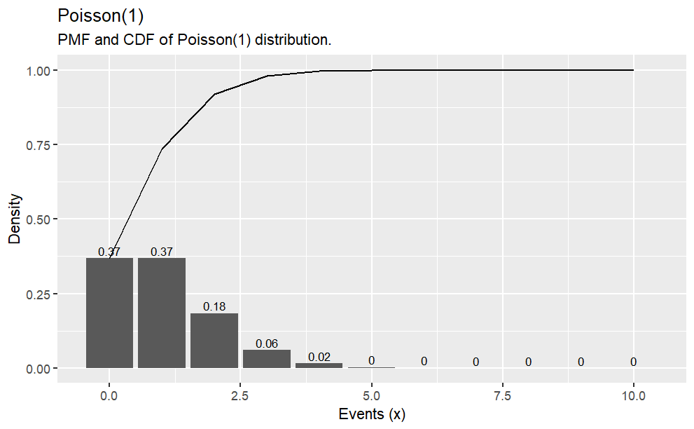{fig-align="center"}# Normal Distribution## **Distribution Functions in R****d**norm: **Probability Density Function (PDF)** of the normal distribution\**p**norm: **Cumulative Density Function (CDF)** of the normal distribution\**q**norm: **Quantile function** of the normal distribution\**r**norm: **Random sampling** from the normal distributionThe probability density function (PDF, in short: density) indicates the probability of observing a measurement with a specific value and thus the integral over the density is always 1. For a value $x$ , the normal density is defined as$$f(x;\mu,\sigma) = \frac{1}{\sigma \sqrt{2\pi}} \exp\Bigg(-{\frac{(x-\mu)^2}{2\sigma^2}}\Bigg)$$where $\mu$ is the mean, $\sigma$ is the standard deviation, and $\sigma^2$ is the variance.Using the density, it is possible to determine the probabilities of each event.For example, you may wonder: What is the likelihood that a person has an IQ of exactly 140?. In this case, you would need to retrieve the density of the IQ distribution at value 140. The IQ distribution can be modeled with a mean of 100 and a standard deviation of 15. The corresponding density is:```{r,eval=FALSE}#Datasample.range <- 50:150iq.mean <- 100iq.sd <- 15iq.dist <- dnorm(sample.range, mean = iq.mean, sd = iq.sd)iq.df <- data.frame("IQ" = sample.range, "Density" = iq.dist)ggplot(iq.df, aes(x = IQ, y = Density)) + geom_point() + ylab("Density (Probability)")#Function to print percentagepp <- function(x) { print(paste0(round(x * 100, 3), "%"))}#Likelihood IQ >= 140?pp(sum(iq.df$Density[iq.df$IQ >= 140]))#Likelihood of 75 <= IQ <= 90?pp(sum(iq.df$Density[iq.df$IQ >= 75 & iq.df$IQ <= 90]))```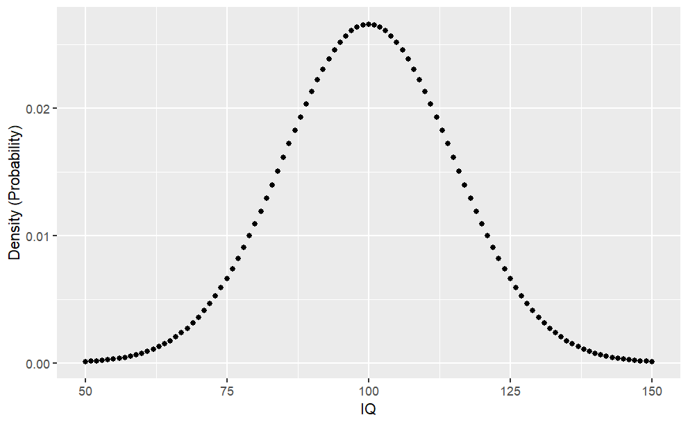{fig-align="center"}## **Cumulative Density Function (pnorm)**The cumulative density (CDF) function is a monotonically increasing function as it integrates over densities via$$f(x;\mu,\sigma) = \frac{1}{2} \Bigg[1+ erf \Bigg(\frac{x-\mu}{\sigma\sqrt{2}}\Bigg)\Biggl]$$where,$$erf(x) = \frac{1}{\sqrt{\pi}}\int_{-{x}}^{x} e^{-t^2}dt$$```{r,eval=FALSE}#CDF Lower Tail (P[X <= x])cdf_lower <- pnorm(sample.range, mean = iq.mean, sd = iq.sd, lower.tail = TRUE)iq.df <- cbind(iq.df, "CDF_LowerTail" = cdf_lower)ggplot(iq.df, aes(x = IQ, y = CDF_LowerTail)) + geom_point()#Likelihood of 50 < IQ <= 90?pp(iq.df$CDF_LowerTail[iq.df$IQ == 90])#CDF Upper Tail (P[X > x])cdf_upper <- pnorm(sample.range, mean = iq.mean, sd = iq.sd, lower.tail = FALSE)iq.df <- cbind(iq.df, "CDF_UpperTail" = cdf_upper)ggplot(iq.df, aes(x = IQ, y = CDF_UpperTail)) + geom_point()#Likelihood of IQ > 125pp(iq.df$CDF_UpperTail[iq.df$IQ == 125])```::: {layout-ncol="2"}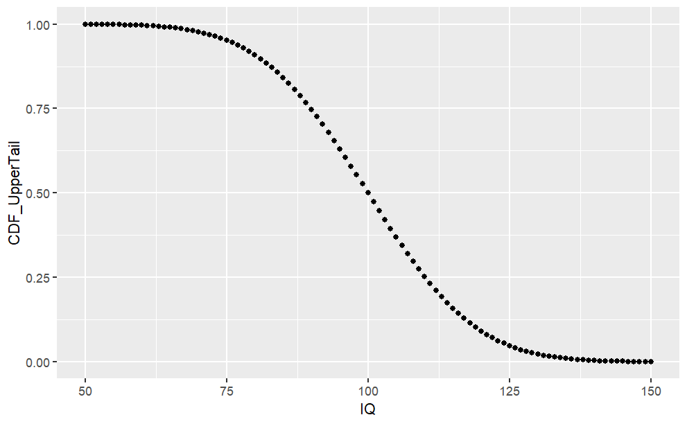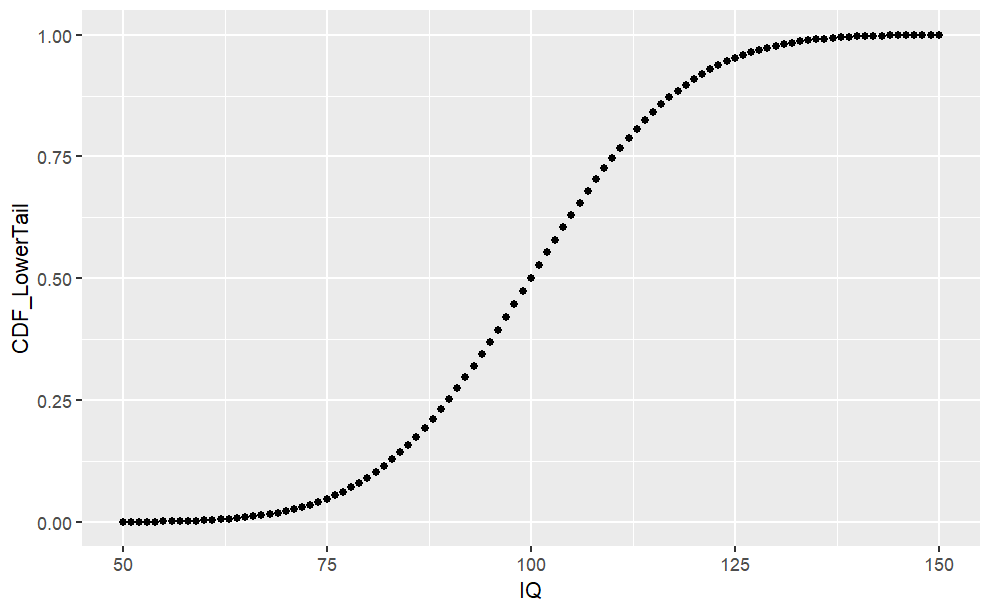:::From the chart above, we can see the cumulative probability distribution of $P(X \le x)$.### **The Quantile Function (qnorm)**The quantile function is simply the inverse of the cumulative density function (iCDF). Thus, the quantile function maps from probabilities to values. Let's take a look at the quantile function for $P(X \le x)$.```{r,eval=FALSE}#List of probabilities from 0 to 100%, by 0.1%prob.range <- seq(from = 0, to = 1, by = 0.001)#Minimum IQ required to reach certain percentileiCDF_lower <- qnorm(prob.range, mean = iq.mean, sd = iq.sd, lower.tail = TRUE)iCDF.df <- data.frame("Percentile" = prob.range, "Min_IQ" = iCDF_lower)ggplot(iCDF.df, aes(x = Percentile, y = Min_IQ)) +geom_point()```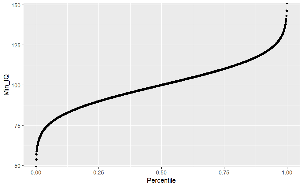{fig-align="center"}```{r,eval=FALSE}#What is the 25th IQ percentile?iCDF.df$Min_IQ[iCDF.df$Percentile == 0.25]#What is the minimum IQ for reaching the TOP-10 or 90th percentile?#Option 1 (Using iCDF table)iCDF.df$Min_IQ[iCDF.df$Percentile == 0.75]#Option 2 (using qnorm)qnorm(0.9, mean = iq.mean, sd = iq.sd)#Or we can see minimum IQ to reach 25th, 50th, 75th, 100th percentile at oncequantile(iCDF.df$Min_IQ)#To see various custom quantiles (eg. 50th to 100th, separated by 10th)quantile(iCDF.df$Min_IQ, probs = seq(from = 0.5, to = 1, by = 0.1))```### **Probability Density Function (rnorm)**When you want to draw random samples from the normal distribution, you can use `rnorm`. For example, we could use `rnorm` to simulate random samples from the IQ distribution.```{r,warning=FALSE,message=FALSE,eval=FALSE}#To fix random seed for reproducibilityset.seed(1)#Law of large numbers: the more samples, #the more mean reaches the expected valuesamples <- c(100, 1000, 10000)#Combine list of sample IQs (rbind) for each samples (sapply)sample.df <- do.call(rbind, lapply(samples, function(x) { #To create a random IQ for each sample size group data.frame("SampleSize" = x, "IQ" = rnorm(x, mean = iq.mean, sd = iq.sd))}))#Plot the results (histograms) for each SampleSize groupggplot(data = sample.df, aes(x = IQ)) + #Create histogram geom_histogram() + #To separate histogram based on different groups (ie. SampleSize) facet_wrap(facets = sample.df$SampleSize, #The groups scales = "free_y") #To fix x-axis scale, #but to allow y-axis to scale dynamically```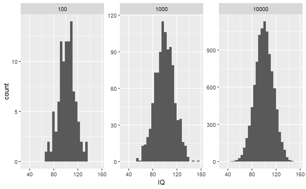{fig-align="center"}```{r,warning=FALSE,message=FALSE,eval=FALSE}#We can also create a sample #(with replacement, aka. independent variables when #taking one sample doesn't #affect the probability of others) from the Probability Density Tablesample_pdf <- sample(iq.df$IQ, size = 100, prob = iq.df$Density, replace = TRUE)sample_pdf.df <- data.frame("IQ" = sample_pdf)ggplot(sample_pdf.df, aes(x = IQ)) + geom_histogram()```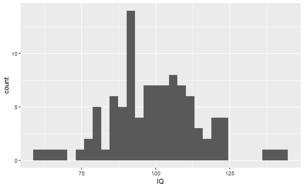{fig-align="center"}# **Simulation of Exponential Distribution**Exponential distribution describes times between events happening at constant rate lambda with expected value $\frac{1}{\lambda}$## Definition$$f_X(x) = \lambda e^{-\lambda x} , x>0 $$Here is a graph of the exponential distribution with mean = 1.### **Sample exponential distribution**```{r,eval=FALSE}set.seed(2021) # for reproducabilitynosim <- 1000 # no of simulationsn <- 40 # no of exponentialslambda <- 0.2 # rate parameter simdata <- matrix(rexp(nosim * n, rate=lambda), nosim)sim_mean <- rowMeans(simdata) # row means# calculate mean, sd and variance of sample exp distsimdata_mean <- mean(sim_mean)simdata_sd <- sd(sim_mean)simdata_var <- var(sim_mean)```With the no of simulations, no of exponentials, and the rate parameter, we can simulate the exponential distribution by multiplying the exponential by the no of simulations, giving us 1000 simulations of 40 exponentials. We put it in matrix form, and use the apply function to find the mean for each row.With this, we can then find the sample mean, standard deviation and variance.### **Theoretical exponential distribution**```{r,eval=FALSE}# calculate mean, df and variance of theoretical exp distt_mean = 1/lambdat_sd = (1/lambda) * (1/sqrt(n))t_var = t_sd^2```# **Histogram of sample exponential distribution vs Averages of simulated exponentials.**```{r,eval=FALSE}par(mfrow = c(1, 2))hist(simdata, col = "steelblue", main = "Simulated exponential distribution", xlab = "40 random exponentials")hist(sim_mean, col = "red3", main = "Averages of Simulated Exponentials", xlab = "Average of 40 exponentials")abline(v = t_mean, col = "green", lwd = 2) # theoretical mean```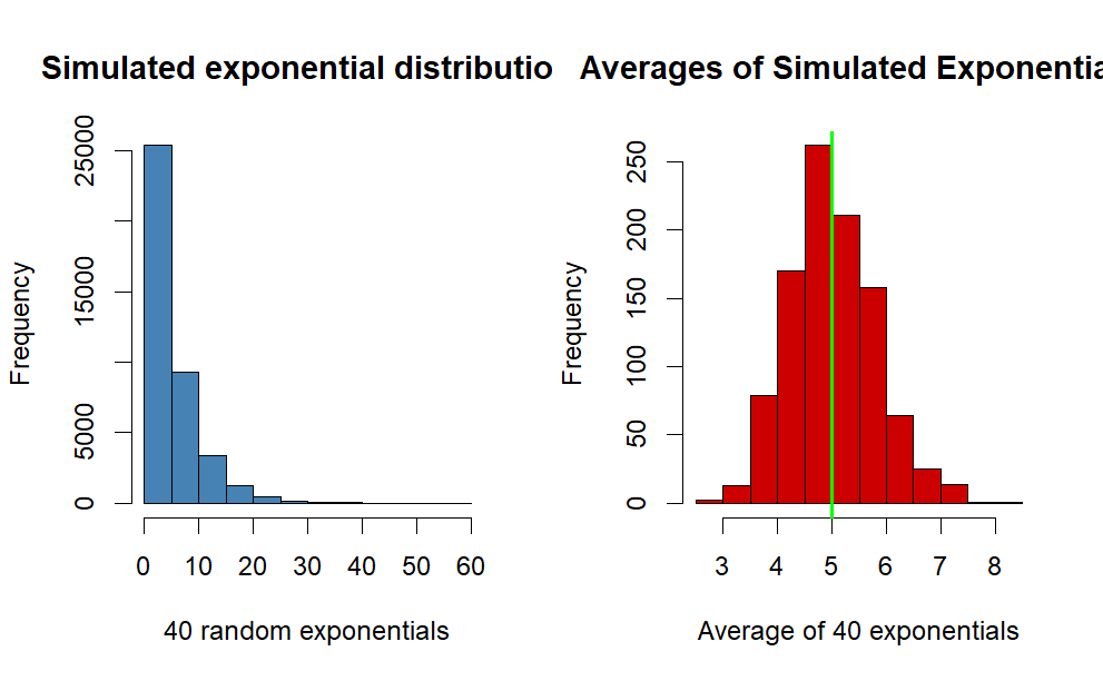{fig-align="center"}**Comment**The blue histogram represents the simulated exponential distribution, as you can see most of the data is at the left side of the plot because of the properties of the exponential distribution.Observing the histogram for the averages of simulated exponentials, we can see it's following the form of a normal distribution. This will be further investigated later on in the report.The green line represents the theoretical mean of the distribution, and our simulated distribution is centered closely at the line.# **Comparison between sample and theoretical statistics**```{r,eval=FALSE}Sample_stats <- c(simdata_mean, simdata_sd, simdata_var)Theoretical_stats <- c(t_mean, t_sd, t_var)diff <- c(abs(t_mean - simdata_mean), abs(t_sd - simdata_sd), t_var - simdata_var)names <- c("Mean", "Std", "Variance")data.frame(Sample_stats, Theoretical_stats, diff, row.names = c("Mean", "Std", "Variance"))```## **Sample Mean versus Theoretical Mean**Observing the table, the sample mean of the exponential distribution is centered at 5.008 whereas the theoretical mean, 1/lambda is 5The difference between the sample and theoretical mean is 0.0086## **Sample Variance versus Theoretical Variance**The sample Variance is is 0.621, which is very close to the theoretical variance, 0.625.The difference between them is 0.0037# **Distribution**## **Histogram and Density plot**```{r,warning=FALSE,message=FALSE,eval=FALSE}library(ggplot2)simdata_mean <- data.frame(sim_mean)ggplot(simdata_mean, aes(sim_mean)) + geom_histogram( binwidth = .3, fill = "steelblue", color = "black", aes(y = ..density..) ) + geom_density(color = "blue", lwd = 1) + labs(title = "Distribution of Random Exponential Values with 1000 simulations", x = "Average of 40 Exponentials", y = "Density") + stat_function( fun = dnorm, args = list(mean = t_mean, sd = t_sd), color = "red", lwd = 1 ) + theme_bw()```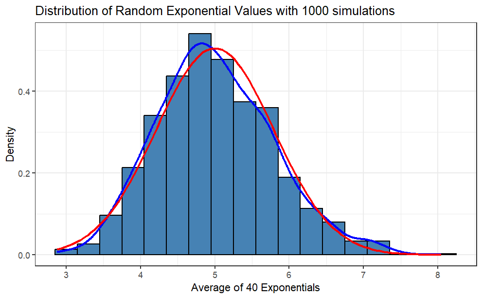{fig-align="center"}**Comment:** The red line is the theoretical normal distribution density, whereas the blue line is the density of the sample distribution. You can see that the sample distribution is approximately normal.## **Q-Q plot**```{r,eval=FALSE}qqnorm(sim_mean, col="black") # sample distributionqqline(sim_mean, col="red", lwd=3) #theoretical```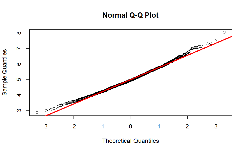{fig-align="center"}Observing the normal Q-Q plot, we can conclude that the sample distribution approximates the theoretical normal distribution quite closely, with the tails being less normal.# **Conclusion**Based on the comparisons and the plots, the simulated sample distribution (as n grows larger) does indeed have similar means and variance with the theoretical distribution. This proves the Central Limit Theorem is in fact true.An important condition for the central limit theorem is that the random variables are IID, which stands for Independent and Identically Distributed. These conditions are satisfied as we simulated the data using R.Here we will investigate the exponential distribution in R and compare it with the Central Limit Theorem. The exponential distribution can be simulated in R with `rexp(n, lambda)` where lambda is the rate parameter. The mean of exponential distribution is $1/\lambda$ and the standard deviation is also $1/\lambda$.To achieve this we will investigate the distribution of averages of 40 exponentials with lambda 0.2, replicated a thousand times.```{r,warning=FALSE,message=FALSE,eval=FALSE}set.seed(1)library(tidyverse)theme_set(theme_bw())lambda <- 0.2n <- 40data <- data.frame(value = c(t(rexp(1000, rate = 1)))) ggplot(data, aes(x=value)) + geom_histogram(aes(y=..density..), binwidth=.25, col="black", fill="lightblue")+ labs(title= "Exponential distribution with mean = 1", caption="Abhirup Moitra") + xlab("x") + ylab("y")```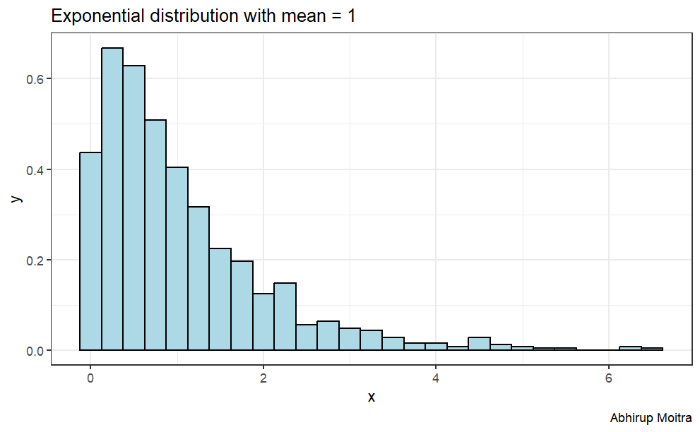{fig-align="center"}The central limit theorem states that if you have a population with mean $\mu$ and standard deviation $\sigma$ and take sufficiently large random samples from the population, then the distribution of the sample means will be approximately normally distributed.This will hold true regardless of whether the source population is normal or skewed, provided the sample size is sufficiently large (usually $n > 30$). If the population is normal, then the theorem holds true even for samples smaller than 30. In fact, this also holds true even if the population is binomial, provided that `min(np, n(1-p))> 5`, where n is the sample size and p is the probability of success in the population. This means that we can use the normal probability model to quantify uncertainty when making inferences about a population mean based on the sample mean.## **Simulation**First we are going to simulate our exponential distribution, and replicated it one thousand times.```{r,eval=FALSE}expData <- replicate(1000, rexp(n, lambda)) # replicate 1000 times expData <- data.frame(value = c(t(expData))) # convert to data frame# plotggplot(expData, aes(x=value)) + geom_histogram(aes(y=..density..), binwidth=.8,colour="black", fill="lightblue") +labs(title= "Exponential distribution with lambda = 0.2 and 40 observations", subtitle = "Replicated 1000 times", caption="Abhirup Moitra") + xlab("x") + ylab("exp(x)")```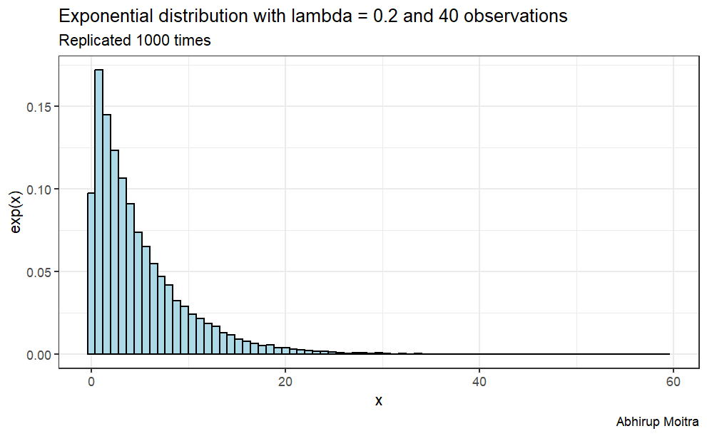{fig-align="center"}According to the Central Limit Theorem, if we take simple random samples from the population and compute the mean for each of the samples, the distribution of sample means should be approximately normal.Thus, we can calculate the mean of the distribution one thousand times and save its value in a data frame and the resulted distribution should be approximately normal.```{r,eval=FALSE}data <- replicate(1000, mean(rexp(n,lambda)))data <- data.frame(value = c(t(data)), size = 40)ggplot(data, aes(x=value)) + geom_histogram(aes(y=..density..), binwidth=.25, col="black", fill="lightblue") + labs(title= "Average of 40 random exponential distribution", subtitle = "Replicated 1000 times", caption="Abhirup Moitra") + xlab("x") + ylab("mean")```{fig-align="center"}## **Sample Mean versus Theoretical Mean**We know that the theoretical mean is given by 1/lambda, so we can calculate it and compare it with the sample mean.```{r,warning=FALSE,message=FALSE,eval=FALSE}theoretical_mu <- 1/lambda # calculate theoretical mean sample_mu <-mean(data$value) # calculate experimental meanggplot(data, aes(x=value)) + stat_function(fun=dnorm, color="black", args=list(mean=mean(data$value), sd=sd(data$value)))+ geom_vline(xintercept = theoretical_mu, colour="red") + geom_text(aes(x=theoretical_mu-.25, label="\nTheoretical mean", y=.2), colour="red", angle=90, text=element_text(size=11)) + geom_vline(xintercept = sample_mu, colour="green")+ geom_text(aes(x=sample_mu+.05, label="\nSample mean", y=.2), colour="green", angle=90) + labs(title= "Theoretical mean vs sample mean", caption="Abhirup Moitra") + xlab("x") + ylab("y")```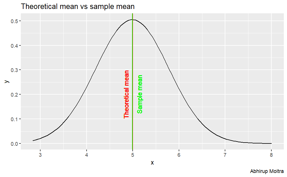{fig-align="center"}## **Sample Variance versus Theoretical Variance**Also, we know that the theoretical variance is given by $1/\lambda^2$, so we can calculate it and compare it with the sample variance.```{r,warning=FALSE,message=FALSE,eval=FALSE}theoretical_variance <- 1/(n * lambda^2)sample_variance <- round(var(data$value),3)ggplot(data, aes(x=value)) + stat_function(fun=dnorm, color="black", args=list(mean=mean(data$value), sd=sd(data$value)))+ geom_vline(xintercept = sample_mu, colour="gray", linetype="dashed")+ geom_vline(xintercept = theoretical_mu, colour="gray", linetype="dashed")+ geom_segment(aes(x = sample_mu, y = 0.36, xend = sample_mu + sample_variance, yend = 0.36), colour="green") + geom_segment(aes(x = theoretical_mu - theoretical_variance, y = 0.35, xend =theoretical_mu, yend = 0.35), colour="red") + labs(title= "Theoretical variance vs sample variance", caption="Abhirup Moitra") + geom_text(aes(x=sample_mu+.55, label="\nSample variance", y=.42), colour="green") + geom_text(aes(x=theoretical_mu-.65, label="\nTheoretical variance", y=.33), colour="red") + xlab("x") + ylab("y")```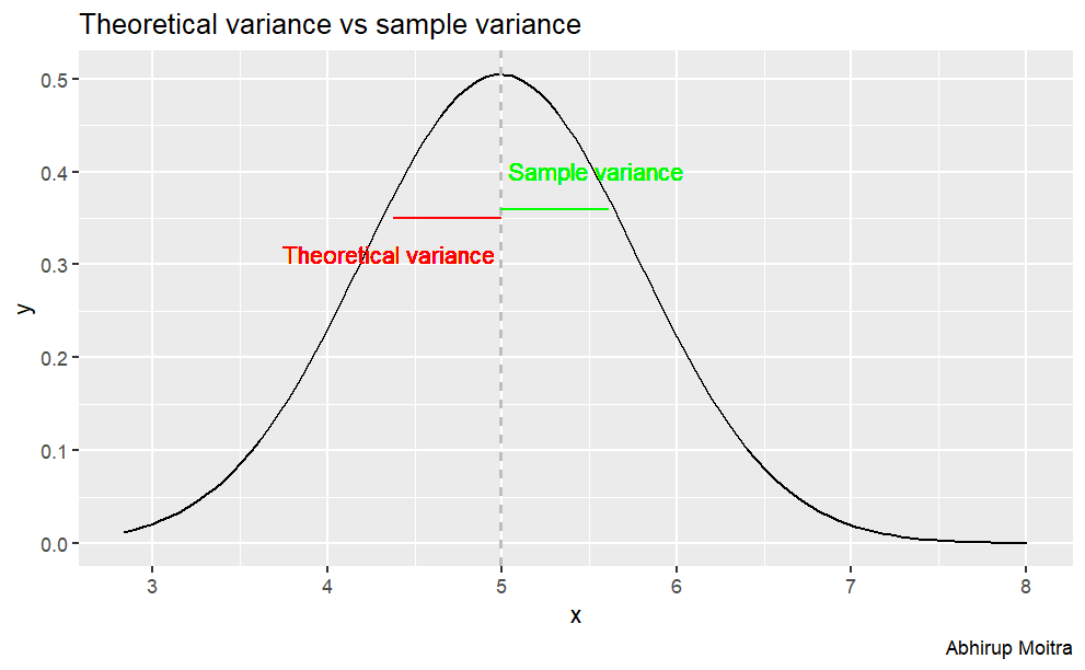{fig-align="center"}## **Distribution: the distribution is approximately normal**In order to show graphically that this distribution is normally distributed, we can normalize it by its mean and standard deviation. This transforms it into a Standard Normal Distribution, N(0,1). So let's do that normalization, plot the histogram of the transformed distribution, and show how it compares to an exact Standard Normal Distribution, by overlaying it:```{r,warning=FALSE,message=FALSE,eval=FALSE}ggplot(data, aes(x=value)) + geom_histogram(aes(y=..density..), binwidth=.25, col="black", fill="lightblue") + stat_function(fun=dnorm, color="blue", args=list(mean=mean(data$value), sd=sd(data$value)))+ labs(title= "Average of 40 random exponential distribution", subtitle = "Replicated 1000 times", caption="Abhirup Moitra") + xlab("x") + ylab("y")```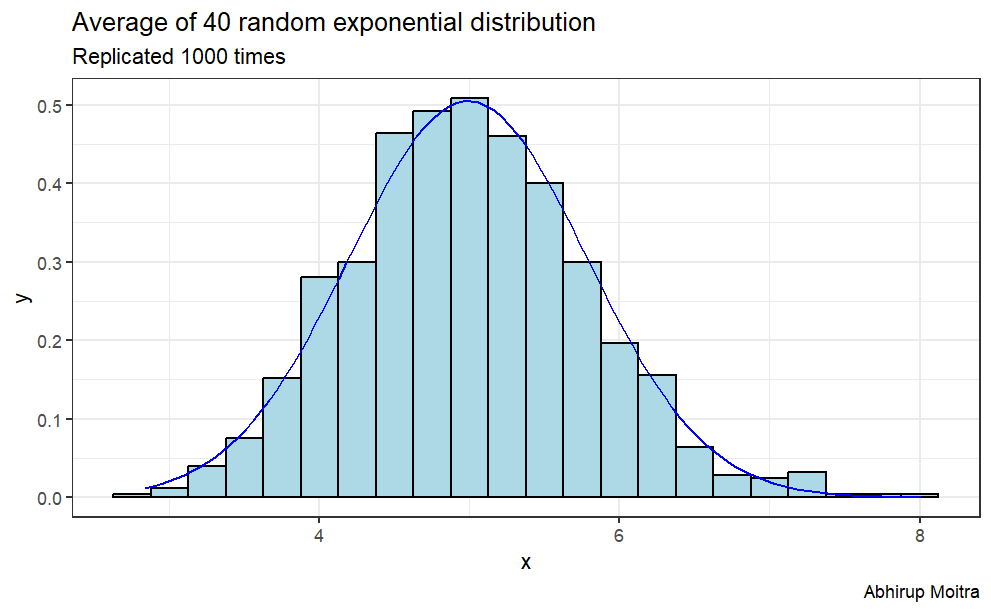{fig-align="center"}{fig-align="center" width="353"}